Sunday 28 February 2016

Abstract Acrylic Paintings

With my sudden addiction to making greeting cards, three art classes, and an almost pathologic need to get through the 50 small painting projects book, I’ve forgotten what I love! Abstract painting… this blog is for you. These two paintings were started about three or four weeks ago and today I was determined to finish them.
The larger one 40cm x 50cm was supposed to be green, yellow, red and black, but as ever I was in a hurry and couldn’t wait for the black to dry. The first layer was really nice but the white of the canvas was showing; more black was added and it covered up some of the good stuff. The green was an acrylic ink and a little watery so when the third layer dried it was very translucent. The final layers were in Jackson Pollock style.  I may work on it some more but for now it’s done.

The smaller one 25cm x 30cm was originally just yellow and black. My husband liked it but I felt it wasn’t finished. Using the JP style, I painted outside in my garden and boy was it cold... but worth it. I love this style of painting because you can always rework it and it’s never wrong.

Thursday 25 February 2016

Painting Project No. 26 & 27 from “Ways to Learn Acrylics”

I’m posting two projects from ‘Little Ways to Learn Acrylics: 50 small painting projects..." by Mark Daniel Nelson today. One is a city scene the other a snow scene, both on 8" x 8" mixed media paper.

Project number 26 ‘Large shapes and small details: City scene’ is a pleasant abstract landscape. The approach to ‘loosely represent the larger shapes in the scene and add a few well-placed details’ seems simple; but in my opinion... it’s not. My painting looked alright, however if the steps weren't mapped out for me, it might not have.


Project number 27 ‘Simplifying a landscape: Snow scene’ in my eyes isn’t a great painting. By not taking it too seriously the results were better than expected. The example in the book had too much blue so I used a lighter shade to make the snow more realistic.

Tuesday 23 February 2016

Painting Project No. 25 from “Ways to Learn Acrylics” - Rooster

Project 25 in ‘Little Ways to Learn Acrylics: 50 small painting projects..." by Mark Daniel Nelson was ‘Painting with coloured shapes: Rooster’. The idea was to paint ‘subjects with soft edges and gradated colours’ and the book indicated that it’s ‘more difficult to paint in acrylics than images with distinct, hard-edged shapes’. It was difficult for me as well, primarily because I was working from a painting and not a photo or real subject.

This project is now at the half way point; only eight more paintings till Chapter 4. It looks like all the paintings till the end of Chapter 3 will be difficult as well. A free style mark making technique is hard to duplicate exactly as the original. Only having the finished painting and not the original image makes it tough to interpret what the artist has in mind… even with instructions.

Sunday 21 February 2016

Craft Day - Greeting Cards

No watercolour class due to half term so my friend Snezana and I had a craft day. She has so much craft paraphernalia that there was too much choice, which made it difficult to know where to start.

My first attempt was easy with a card Snezana prepared earlier to use as a guide. It was really labour intensive (seven layers and some tinting with inks) to put everything together; but when I was finished I was hooked. It’s so rewarding to know that you designed (well sort of) and crafted something so beautiful. I hope my mother in law appreciates my effort:).


For the second card we looked on Pinterest for ideas and found this butterfly card that was absolutely gorgeous. Can’t find the link but when I do I’ll add it here. Snezana didn’t have the same butterfly stamp so we used one from her many binders. The embossed brick background was also different from the original and I added a ‘with love on your birthday’ stamp for my father in law's birthday. O.k. so everything doesn’t line up perfectly and my photo isn’t that great, but that adds to the appeal, right?


For my third try the butterfly card was so nice a similar version seemed ideal. This time with less layers and a fitting sentiment stamp (I hope) for my Aunt. The fewer layers made it lighter so mailing it to America wouldn’t be so expensive. The day went by so fast that this card was put together after I got home. Instead of sticky tape I used PVA glue and the butterfly paper got all crinkly, which luckily you can't see in the photo.

I am so hooked on making cards that I bought a permanent adhesive roller a ‘handmade by’ & balloon stamp; I also want to buy embossing powder and a few other stamps. Going to try and keep spending to a minimum but my husband doesn’t believe me:(.

Thursday 18 February 2016

Painting Project No. 24 from “Ways to Learn Acrylics” - Abstract

Project 24 in ‘Little Ways to Learn Acrylics: 50 small painting projects..." by Mark Daniel Nelson was ‘Redefining the brushstroke: Drip Painting’. Jackson Pollock is one of my favourite artists so there was no trouble making this painting. The only thing is knowing when to stop. I took a few photos of the different layers just for fun.

Tuesday 16 February 2016

Painting Project No. 22 & 23 from “Ways to Learn Acrylics”

Moving right along; I’ve posted two landscape projects from ‘Little Ways to Learn Acrylics: 50 small painting projects..." by Mark Daniel Nelson.

Project number 22 ‘Varying brushstrokes: Road and sky’ came out nicer than expected. Most of the landscape projects in this book haven’t really been my thing. For some reason I liked this one; it’s loose, was easy to create and the image is easy on the eye.

Project number 23 ‘Using loose strokes: Impressionist landscape’ didn’t come out as well as the previous one. The technique was similar but the colours were more vibrant. This painting was hard for me because I was working from the artists painting and not from my own image. I like the technique but would like to try it on one of my own landscape photos.

Saturday 13 February 2016

Royal Academy, British Museum & Tate Modern - London 2016

My birthday was last Saturday and my husband took me to London for the weekend. He bought me a membership to the Royal Academy of Arts and we went to see the ‘Painting the Modern Garden: Monet to Matisse’ exhibition. It was Friday night and very crowded so there wasn’t enough time with each painting. I want to go back and get a better look some time during the week. The great thing about becoming a friend of the RA is you can go to the exhibits for free.

On Saturday, we went to the British Museum for 
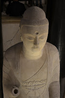
Francis Towne’s watercolours of Rome.  It was pretty amazing to see all these fantastic paintings in watercolour from 200 years ago. It’s the first time I’ve seen so many watercolour paintings in one place by one person. It was also interesting because Towne used ink and wash for most of his paintings and I love that technique. The museum had some wonderful sculptures as well.

On the way home on Sunday we walked down the south bank and I got some really great photos of performers that would be nice to paint.
We also went through the Tate Modern to see what exhibit was in the Turbine Hall, but weren’t too impressed. It wasn't a wasted trip because the book store had a great selection of books to improve painting skills; it was nice to browse and see what might be interesting. I picked up three that looked good and bought two on Amazon…more about that later.
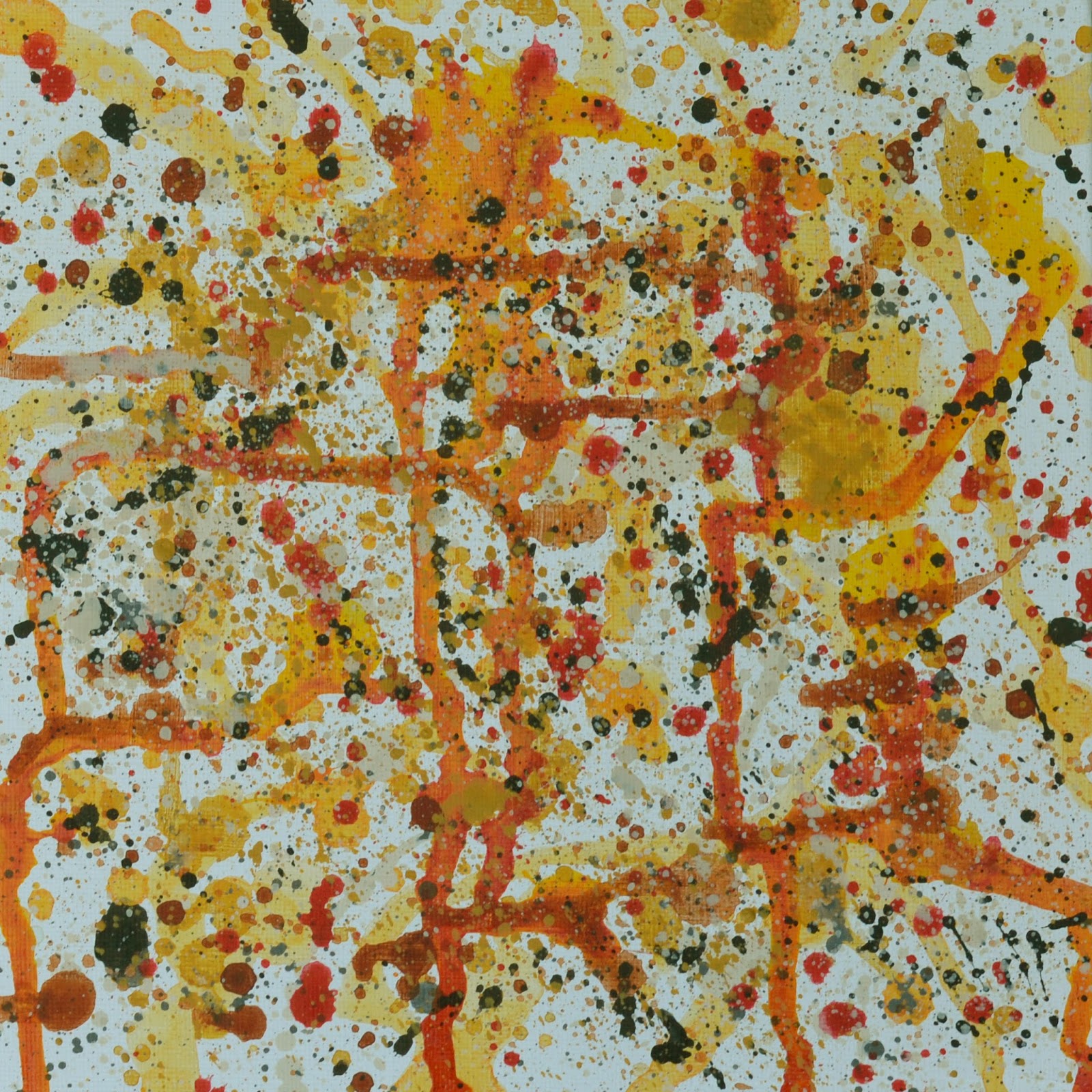
Thursday 11 February 2016

Painting Project No. 21 from “Ways to Learn Acrylics” - Flowers

Project 21 in ‘Little Ways to Learn Acrylics: 50 small painting projects..." by Mark Daniel Nelson was ‘Using expressive strokes: Flowers in a glass’. The instructions for this exercise were to create simple shapes for the flowers by scribbling or hatching.

Because I don’t like to see white on the canvas, my first version had a light purple background.


The purple background didn’t allow the flowers to look as vivid, so I prepared a second painting with a white background. This painting was done very quickly and the flowers were brighter; but I think the first one is better… possibly because it’s tidier.

Tuesday 9 February 2016

Portraits – Pencil, Watercolour Tone & Colour

So last week all my art classes were on the topic of portraits.

On Monday at The Seasons Art Class  we studied 'Figure Drawing, the construction of a body and face’. My body drawing didn’t come out as well as my face drawing. The exercise was to draw the head shape then shade it in with pencil; then draw in the eyes and use measurements to place the nose, mouth and chin. After the final step of drawing the ears and hair, I decided my face looked like Jude Law.


On Wednesday in Wendy’s  class we painted a portrait in watercolour. I always have trouble painting in watercolour, so I painted the same subject the tutor demonstrated in class. It was a good result but wasn’t as easy as Wendy makes it seem.


On Thursday in Karen’s class we did a tonal study of a person that Karen photographed. My watercolour, of course, didn’t come out half as well as Karen’s. I was happy with it, except for the eyes, which I didn’t manage to capture properly…mainly because they were in shadow.

Friday 5 February 2016

Painting Project No. 20 from “Ways to Learn Acrylics” - Bird's nest

The second painting, project no 20 from Chapter 3 in ‘Little Ways to Learn Acrylics: 50 small painting projects..." by Mark Daniel Nelson was ‘Using hatching strokes: Bird’s nest’. The assignment was to use directional brush strokes to create the illusion of form. It was very similar to project no 19 and also harder to create than it looked. After spending way too much time on the bird's nest, I decided to stop over working it. Again the example in the book was nicer than my painting... hope this doesn't become a trend.

Wednesday 3 February 2016

Painting Project No. 19 from "Ways to Learn Acrylics"

After much anticipation it’s time to start Chapter 3 in "Little Ways to Learn Acrylics: 50 small painting projects..." by Mark Daniel Nelson. This chapter is less about acrylic painting fundamentals and more about design principles and brushstroke techniques.

Project number 19 ‘Using contour strokes: Ball of wool’ is all about how the stroke direction can make the object look three-dimensional. This wasn't as easy to accomplish as it might seem. In hindsight, the top of the ball would probably look better if it was a little lighter; for this exercise the painting in the book was nicer.