
Tuesday 22 December 2015
‘Abstract Acrylic’ Study No. 4 – Mixed Media
Saturday 19 December 2015
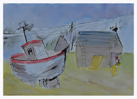
Painting Project No. 8 from 'Ways to Learn Acrylics'
Project number 8 ‘Understanding light, shadow and planes’ from "Little Ways to Learn Acrylics: 50 small painting projects..." by Mark Daniel Nelson was the most difficult exercise in the book so far. The first attempt was not successful for too many reasons to list. I almost gave up but instead decided to do another one completely from scratch.
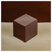 To save canvas the second painting was done on acrylic paper, which didn’t look as nice. My stay wet pallet was handy to keep the mixed paint fresh so doing each section more than once was not a problem. When a line went wrong I would simply wait for it to dry and paint another. Lines are difficult freehand, especially the corners, so when it looked presentable I stopped. The only thing not completed was the step to add a line for the box lid; it didn’t work in the first painting and I didn't want to ruin it.
Perspective is really difficult for me, so I’ve bought a book… will blog about it another time.

Perspective is really difficult for me, so I’ve bought a book… will blog about it another time.
Tuesday 15 December 2015
‘Abstract Acrylic’ Painting Exercise No. 3 - Work Sequence A
Assignment number 3 in “Abstracts 50 Inspirational Projects” by Rolina van Vliet turned out really nice, even though my painting is a slight deviation from the monochrome colour requirements specified in the book.
 To make starting the project easier, I followed the examples in the book and used red with gold outlines. After that, my own colours and marks were used. I had fun with a new tube of Pebeo relief outliner paint and may have gone a little design crazy, but I'm happy with the results. After all it’s my abstract... the book just gave me inspiration.
 To make starting the project easier, I followed the examples in the book and used red with gold outlines. After that, my own colours and marks were used. I had fun with a new tube of Pebeo relief outliner paint and may have gone a little design crazy, but I'm happy with the results. After all it’s my abstract... the book just gave me inspiration.
Friday 11 December 2015
Painting Project No. 7 from 'Ways to Learn Acrylics'
My next project in "Little Ways to Learn Acrylics: 50 small painting projects..." by Mark Daniel Nelson is No. 7 'Introductions to values: Misty mountains'. The first painting was not successful because the colours were way too green and I accidentally omitted the last layer (sky).
 When the paint was dry I tried again; matching the hue of the the dark mountains and lighter ones behind was easy. The next layers were more difficult because I wanted to move away from the green tint that I mixed in the first painting. Instead of adding only unbleached titanium I mixed in some ultramarine blue and titanium white; this made the paint look bluer. The exercise calls for only adding unbleached titanium to the mixtures, but this made the lighter layers look green.
 Because I painted over the first try you can see some of the previous layers. I could fix it, but probably only make it worse. I really enjoyed this exercise, it helped me to learn about mixing values and colours. Additionally, it provides more practice working with edges, hopefully by the end of the 50 projects I will be able to have clean edges in all my paintings.
Tuesday 8 December 2015
‘Abstract Acrylic’ Painting Exercise No. 2 - 'Working from a figure sketch'
This study involved working from a figure sketch and drawing it abstractly in ink; even though I took a life drawing class this wasn’t easy. It also required sand, which I couldn’t find, so I used a sand & modelling paste mixture.
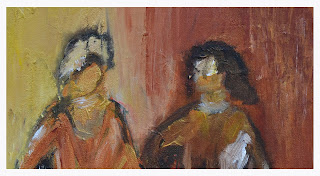 My first attempt didn’t look right because the ink figures weren’t anatomically correct so I started again. The second time wasn’t really successful either, so I cropped the painting and have posted it even though it's not perfect. I enjoyed using the sand mixture and liked the way ink worked with wet paint, but my figures looked funny. It's difficult to get an accurate body shape that is also abstract.
 Rolina van Vliet has done it to perfection in her example on pages 52 & 53 of “Abstracts 50 Inspirational Projects”. This is a method I would really like to explore more.
 My first attempt didn’t look right because the ink figures weren’t anatomically correct so I started again. The second time wasn’t really successful either, so I cropped the painting and have posted it even though it's not perfect. I enjoyed using the sand mixture and liked the way ink worked with wet paint, but my figures looked funny. It's difficult to get an accurate body shape that is also abstract.
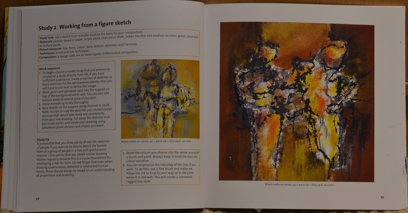 Rolina van Vliet has done it to perfection in her example on pages 52 & 53 of “Abstracts 50 Inspirational Projects”. This is a method I would really like to explore more.
Saturday 5 December 2015
Ways to Learn Acrylics…Painting Project No. 6
The next project in Mark Daniel Nelson’s book “Little Ways to Learn Acrylics: 50 Small painting projects to get you started” was 'Applying a simple glaze: Bread and butter’.
 My first attempt at drawing the piece of toast was inaccurate so I decided to do it in pencil first and then paint over it. How hard could a simple square with a bubble on top be? After adding all the layers it certainly proved difficult to do; it didn’t resemble the example in the book, but it looked good enough.
All my painting teachers say that mixing primary colours makes paintings look better and more cohesive, but it’s nice to use paint out of the tube because it makes fixing mistakes easier. I might try this one again after I’ve done all 50 from the book…watch this space.
If you’re doing these exercises too, I’d like to know how you’re getting on, please leave a comment or e-mail me.
Tuesday 1 December 2015
‘Vibrant Acrylics’ Sixth Painting Exercise Benny the Cat

Thursday 26 November 2015
Ways to Learn Acrylics… Painting Project No. 4 & 5
In the first three projects of Mark Daniel Nelson’s book “Little Ways to Learn Acrylics: 50 Small painting projects to get you started” I didn’t use a round brush. I used either a filbert or flat in all my previous paintings, because it seemed easier. However, in these next two paintings I took the advice of the author and used a round brush. It was nice to use something different and now I’ve gained a better understanding of round brushes.
 Project no. 4 ‘Simple gradations: Deep blue sea’ looked easy enough, but of course it wasn't. It took me four tries: the first wasn’t bad but the canvas wasn’t completely covered, the second time I needed to go back to a previous layer but didn’t save the colour, the third time I remembered to save a little of each colour but when the layers dried there was a visible line between layers. The final painting wasn’t perfect but after four times and a lot of wasted paint…I gave up.
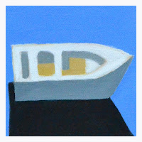 In project no. 5 ‘Using the white of the canvas: Rowing boat’ it was difficult to create clean lines; possibly because the whole canvas was white. The blue for water is lighter because I used paint from project no 4 and the yellow was darker in value from the book because I liked it better. All in all it looked pretty good and now it’s my second favourite painting from the book.


Sunday 22 November 2015
'Abstracts 50 Inspirational Projects’ Study 1 – Expressive Painting Style
Besides doing the exercises in "Vibrant Acrylics" and "Ways to learn Acrylics…" I’m now trying out another book by Rolina Van Vliets. "Abstracts 50 Inspirational Projects" has enough lessons to keep me busy; it’s very similar to her other book "Painting Abstracts ideas, projects and techniques" that I reviewed a while ago. This book has 50 studies, each on a different topic with images to use only as a guide. Rolina says it's better if you don’t have images and simply work out of your own imagination. That however, only works in her classes where she can observe and be there to answer questions. She has included some of the paintings from her students and it makes the book more interesting.
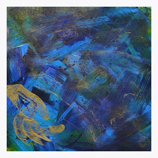 In the first study ‘Expressive painting style’ the work sequence was not for me; I didn’t like making scratch marks. I made a few changes with a putty knife and dripping paint; obsessed over it for a few days then decided the final painting was pretty good. The assignment was to create a painting that was spontaneous and the stroke directions projected action and variation. I think I achieved that:))
 In the first study ‘Expressive painting style’ the work sequence was not for me; I didn’t like making scratch marks. I made a few changes with a putty knife and dripping paint; obsessed over it for a few days then decided the final painting was pretty good. The assignment was to create a painting that was spontaneous and the stroke directions projected action and variation. I think I achieved that:))
Thursday 19 November 2015
Ways to Learn Acrylics... Painting Project No. 3
'Little Ways to Learn Acrylics: 50 small painting projects to get you started’ by Mark Daniel Nelson is a great way to practice painting with acrylics.
Of the first three projects, this colour mixing pasture scene was my least favourite.
Getting the lines clean when dark colours met lighter colours was really difficult.
The hues weren’t very inspiring either, but for some reason I painted a second version.
The Atelier Interactive paints are meant to stay wet longer and to enable the painter more time blending. There was a visible difference between the two paintings. The first painting (in System 3 acrylics) needed three layers of paint before it looked finished. With the Atelier only one coat was applied and although a second layer would have made it look better… I lost interest.
This post isn’t very encouraging; for archival purposes I felt it necessary to post it. Sorry, dreary day, sombre mood.
 |
| System 3 |
 |
| Atelier |
This post isn’t very encouraging; for archival purposes I felt it necessary to post it. Sorry, dreary day, sombre mood.
Wednesday 18 November 2015
‘Vibrant Acrylics’ Fifth Painting Exercise - Antiques and Tennis Ball
Can’t believe it’s over a month since I painted the roses. The fifth exercise ‘Antiques and Tennis Ball’ from Vibrant Acrylics by Hashim Akib looked really awesome but also difficult; that’s probably why it took me so long to finish.

I have a definite problem with perspective and it keeps cropping up every time I try a still life or building. I’ve had classes on perspective, read articles and watched You Tube videos and they always makes sense, but when it comes to drawing or painting…I don’t know what happens. Anyway the painting came out nice enough, except for the dog statue, which BTW was supposed to be a lion:)). Hopefully the next exercise will be finished sooner, but no promises.

I have a definite problem with perspective and it keeps cropping up every time I try a still life or building. I’ve had classes on perspective, read articles and watched You Tube videos and they always makes sense, but when it comes to drawing or painting…I don’t know what happens. Anyway the painting came out nice enough, except for the dog statue, which BTW was supposed to be a lion:)). Hopefully the next exercise will be finished sooner, but no promises.
Sunday 15 November 2015
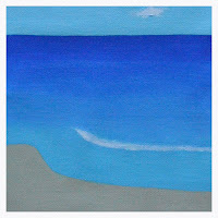
Ways to Learn Acrylics… Painting Project No. 2

 The second painting was on acrylic paper, size 10” x 10”; I wanted to compare canvas with paper and see what a larger study would look like. The 8”x8” canvas was the better; the acrylic paper didn’t blend as well and the larger size didn’t look as nice. The sunset on acrylic paper was only one layer and if a second layer was put on it probably would look a little nicer.
The assignment instructions were to dry each layer before putting the next layer on, it was easier for me to blend if I kept the previous layer wet. It was a good exercise and the finished painting was pretty.
Thursday 12 November 2015
Art Materials Live – Birmingham NEC
Art Materials Live on Friday the 6th of November was worth the trip. It was interesting because the event was combined with craft and gift items, which seemed larger than the art section. Although small, the Art section took most of my time and I participated in four hands on art demonstrations.
The SAA had the biggest area with two sections for art talks, two for hands on demos and the middle area for products sales. It was a much smaller version of ‘All About Art’ in London.

 At this event, I painted a snow scene in watercolour with Matthew Palmer, then of course bought two lift out brushes. Next was a session on pastel painting with Jeremy Ford where I proceeded to buy a pastel kit :).
 Linda Matthews had her own small demonstration area and I tried my hand at using permanent ink and watercolour; it was my favourite painting of the day. Linda has a variety of classes teaching different mediums both in the U.K. and abroad. She is very easy going and personable and I want to take a painting class with her; hopefully sometime this summer.
Finally, the Chinese Brush Painting Society gave a small hands on lesson; it was very useful to learn how to mix the ink, hold the brush and remove excess liquid properly. We also were able to practice making marks on cartridge paper and just for fun how to draw a cat and mouse. I was really impressed and bought a brush at the stall and ink from the SAA.
The SAA had the biggest area with two sections for art talks, two for hands on demos and the middle area for products sales. It was a much smaller version of ‘All About Art’ in London.


 Linda Matthews had her own small demonstration area and I tried my hand at using permanent ink and watercolour; it was my favourite painting of the day. Linda has a variety of classes teaching different mediums both in the U.K. and abroad. She is very easy going and personable and I want to take a painting class with her; hopefully sometime this summer.
Finally, the Chinese Brush Painting Society gave a small hands on lesson; it was very useful to learn how to mix the ink, hold the brush and remove excess liquid properly. We also were able to practice making marks on cartridge paper and just for fun how to draw a cat and mouse. I was really impressed and bought a brush at the stall and ink from the SAA.
Thursday 5 November 2015
New Book ‘Little Ways to Learn Acrylics: 50 Small painting projects to get you started’
Past experience with my ‘3xWeekly’ acrylic paintings was invaluable, however it was difficult to keep up. I’ve decided to make things a little simpler for myself with this great book ‘Little Ways to Learn Acrylics: 50 Small painting projects to get you started’ by Mark Daniel Nelson. The book goes back to basics and all the decisions are made for you; the only thing to do is paint.
As usual supplies had to be purchased. On my favourite art supply website I found 8” x 8” Loxley canvas boards(box of 60) for £53.78. Because shipping was free I had to buy some new acrylic paint colours; viridian hue and alizarin crimson. They weren’t available in System 3 heavy body so I bought Liquitex and can’t wait to try them.
 The first painting assignment was a black and white study. Even though it looked simple, I did learn something.
As usual supplies had to be purchased. On my favourite art supply website I found 8” x 8” Loxley canvas boards(box of 60) for £53.78. Because shipping was free I had to buy some new acrylic paint colours; viridian hue and alizarin crimson. They weren’t available in System 3 heavy body so I bought Liquitex and can’t wait to try them.

- Waiting for layers to dry can make things easier
- If you need clean lines, use a wet wipe and/or your finger to clean up...best if you let one side of the paint dry (see 1st bullet)
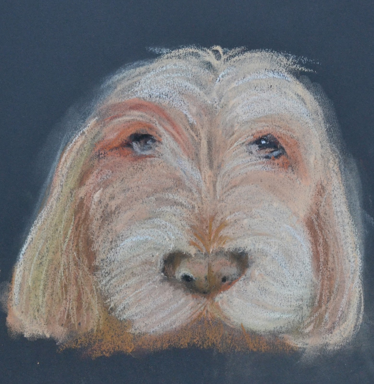
Thursday 15 October 2015
‘3xWeekly’ Great Dane from Kids for Kids Charity Day

Tuesday 13 October 2015
‘Vibrant Acrylics’ Fourth Exercise - a Rose
The fourth exercise 'Paint a flower in fifty brushstrokes' from ‘Vibrant Acrylics’ was completed back at the beginning of September because, as usual, I was impatient.
 To do all the exercises in order I’ve repeated the rose painting; this time using bigger brushes and canvas. For some reason, painting shapes isn’t easy for me, especially getting the right perspective. The second painting looked worse than the first; so I decided to paint over it for a third try.
 It took many attempts to get a good photo of the third painting because the texture from the previous one shows through. After looking at them, it seems I may have put too much deep violet in all three. I'll keep trying this exercise until I’m happy with the results... but don't worry I won't bore you with them:))


Sunday 11 October 2015
‘3xWeekly’ Paint My Photo Rooster (or is it a Chicken)
 This week’s paintings were just taking too long and the intended painting of a Great Dane couldn’t be finished in time. In order to stick to my '3xWeekly' promise I found a photo that could be completed quickly. The plan was to paint the rooster from Paint My Photo in a loose ‘Vibrant Acrylics’ style. It’s similar to the rooster that I did at ‘All About Art’; I’m really happy with the results and it only took about 2 hours.
Saturday 10 October 2015
'3xWeekly' Marie's Cat Photo
For some reason painting is getting harder and harder. The size, colour, composition and style are always such difficult decisions for me. Why isn't it getting easier, this is my 26th pet portrait. I don't yet have a specific style and each photo presents it's own issues. Because my time is limited (3xWeekly)... it may just be too much pressure.
 This photo was taken from my sister-in-laws Facebook page; Marie loves cats and always takes wonderful photos. I'm happy with the results, although as usual, I feel it could have been better with more time.

Thursday 8 October 2015
‘3xWeekly’ My Brother’s German Shepherd Dog - Bart
 This painting is of my brother’s first dog Bart. I’ve painted him before and had already prepared a black, white & grey canvas to glaze. Planned on finishing this in half a day… ha! It’s been over three weeks and after MULTIPLE glazing layers it’s not finished… but I’m done. With every new layer the portrait changes and could probably do with more light and shade but I’ve truly lost interest.
Tuesday 6 October 2015
Life Drawing at Ericaceous Art

Sunday 4 October 2015
‘3xWeekly’ A Pastel Dog Image from PMP
Saturday 3 October 2015
‘3xWeekly’ Cherie’s Sleeping Labrador
 This week as usual, I was falling behind on my 3xWeekly pet portraits. Wanting everything to be perfect is a dangerous thing, especially when you’re learning. Anyway, with a shopping addiction and the constant barrage of e-mail from art supply shops, I bought more System 3 Heavy Body Acrylics. With the paint came a free CD from my current favourite artist Hashim Akib. ‘Lay It On Thick Spread It On Thin’ was the perfect inspiration for this painting of my friend Cherie’s Labrador. I spotted the dog's photo a while ago and thought it would make a nice painting; after watching Hashim paint the goldfish it all came together.
Thursday 1 October 2015
‘3xWeekly’ My Friend's Dog - Totoro

 My friend posted a picture of her dog Totoro on Facebook and he is absolutely adorable. Hopefully Lynn will think I’ve done an o.k. likeness. I made a few sketches in graphite, then a quick drawing in soft pastel, then another in oil pastel with colour. Although there was a lot of initial prep work, this painting didn’t come easily.
The final portrait was done in acrylic on 8” x 10” board without tracing. There are a lot of things that could be fixed on this painting, but I'm never going to get 3 a week done at this rate.

Tuesday 29 September 2015
‘Vibrant Acrylics’ Third Exercise
Virtually seconds... well really, hours from completing two dog portraits; so I’m posting a painting from a ‘Vibrant Acrylics’ lesson instead. Prepared two or three weeks ago this is the third exercise in the book and it's titled ‘Resisting White’.
 The painting is a combination of yellow ochre, sap green, deep violet, cadmium yellow, burn sienna, titanium white and lemon yellow. This was a fantastic exercise and although it didn't look exactly like the example in the book, I was completely satisfied. Thinking back, I did really enjoy an art class where we painted white objects.

Saturday 26 September 2015
‘3xWeekly’ Paint My Photo - Malamute Dog
 Found a fabulous picture of a Malamute while searching on PMP-art. This time I didn’t just start the painting without preparation: my first step was to draw the dog on A3 paper in graphite, then two smaller versions with watercolour pencils.
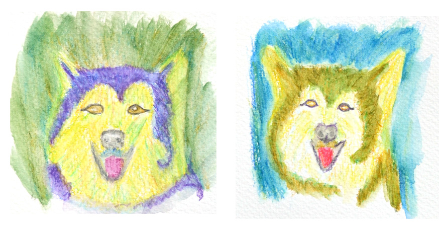
For the final painting the dog’s outline was traced with a printout onto A3 board primed with cobalt blue & titanium white. Using colours from the ‘Vibrant Acrylics’ cat lesson, the dog’s image came to light. It’s not an exact representation of the photo, but I’m happy with the result.

Thursday 24 September 2015
'3xWeekly' Pet Portrait Lucy My Tibetan Terrier
Found an old picture of Lucy after her first visit to the groomer; let me tell you it was a shock. Now her hair is usually short…but not that short.
 Tried to keep the painting loose and small so it could be finished quickly…well that didn’t work. After a week trip to the US to see my aunt in the hospital, the painting did take A LOT longer. Although not completely happy with the painting, I've decided it's finished. The portrait was on heavy cardboard so it was easy to adjust the size with a heavy paper cutter. The original image was A4, but after cutting off the bottom, it's now 8"x10". It was great to be able to see what the difference would be in Photoshop before actually cutting it.
  |
| B4 Groomer After Groomer |

Tuesday 22 September 2015
'3xWeekly’ Another PMP Image - Harvey the Boxer Dog

Saturday 19 September 2015
'Vibrant Acrylics' first two exercises
As promised, I am working my way through the exercises in the ‘Vibrant Acrylics’ book by Hashim Akib.
 The first exercise ‘Using generous strokes’ was a lesson in making confident marks with big strokes and not overworking the paint. It was tough using a large 2" brush as the artist suggested, so most of the painting was done with a 1" short flat. The background colour was process magenta & titanium white; the example in the book had a lot more of the background showing. It was also hard not to overwork the painting… but for my first try it wasn’t a total disaster.
 The second exercise ‘Let’s Paint’ was a still life image using strong primary colours. The background was made with cadmium orange & titanium white. Again I had trouble using the large 2" brush, so mostly the 1 1/2 “, 1” & ¼” flat brushes were used. It was difficult to draw the images with a paint brush and I found my perspective and size of the elements not quite right. When completed, though, I did like the final painting and enjoyed the process.
Both images were painted on sheets from Blick Studio canvas pad size 16" x 20", bought while in NYC. Hashim's instructions were to use 24" x 18", but I'm not sure it would change my mind about the 2" brush. Painting larger and with heavy body acrylics is different and really enjoyable; some day I'll try a larger canvas.
 The first exercise ‘Using generous strokes’ was a lesson in making confident marks with big strokes and not overworking the paint. It was tough using a large 2" brush as the artist suggested, so most of the painting was done with a 1" short flat. The background colour was process magenta & titanium white; the example in the book had a lot more of the background showing. It was also hard not to overwork the painting… but for my first try it wasn’t a total disaster.
Both images were painted on sheets from Blick Studio canvas pad size 16" x 20", bought while in NYC. Hashim's instructions were to use 24" x 18", but I'm not sure it would change my mind about the 2" brush. Painting larger and with heavy body acrylics is different and really enjoyable; some day I'll try a larger canvas.
Thursday 17 September 2015
‘3xWeekly’ Looking for inspiration


I had to stop working on it. In this photo, the edges were cropped to make the painting look better. There is a pattern beginning to form here…I can’t even do '3xWeekly' never mind daily. Don’t know why some paintings are easy and others very difficult. Hopefully I will begin to improve and start painting faster.
To get to 100 pet portraits I need more inspiration and many more dog or cat photos. If you would like a non professional painting of your pet, please send me photos. Preferably of the animal looking at the camera... sorry, I know it's hard to get those photos. Don't expect anything too great; they will not be photo realistic because that's not my style. Most will be on A4 paper and some on A3. You can e-mail me an electronic copy at amsonart@gmail.com... I’ll post my painting on this blog and if you like it and live in the UK, I will mail it to you.
Tuesday 15 September 2015
Kids for Kids Charity Day with Artist Karen Pearson
Karen Pearson, an artist/teacher, was supporting a Kids for Kids charity by having a painting and sketching event. The day was held in Dorking and hosted by Juliet and Mark; their garden was open to artists of all abilities using any paint medium. The cost of the day was £15; a sum that would buy 3 hens and a rooster or a mosquito net to protect children from malaria. The charity founded by Patricia Parker MBE had a goal for the day to raise enough money to also buy goats which could be bred to provide milk and meat for hungry families.
 The event was fantastic; you can tell a lot of preparation went into planning it and the weather was beautiful. Karen gave a short tutorial on drawing and painting en plein air; she also gave everyone a list of ideas with compositions organized throughout the garden.
 The dog in the picture was not part of the arrangement but I couldn’t resist.
Maybe I'll paint her in a '3xWeekly' pet portrait.
The dog in the picture was not part of the arrangement but I couldn’t resist.
Maybe I'll paint her in a '3xWeekly' pet portrait.

 The composition I chose to draw was popular, so I also decided to draw an artist while she was drawing the shed. Karen and another artist, whose name I don’t remember…sorry, came around to help with any questions or in my case some drawing advice. Later, I drew another setting, an apple tree with a wheel barrel; didn't like it but then proceeded to draw the person drawing the apple tree. These drawings weren't very good and I'm not going to show them. The gardens were so beautiful I spent a lot of time walking around, taking in the scenery and talking with other artists. It was a gorgeous day and if there is ever another opportunity to do this... I will in a heartbeat.
 At home, I decided to tackle a drawing with watercolour pencils from a picture I took on the day. I really like pencils, you have so much more control than with a paint brush.


 The composition I chose to draw was popular, so I also decided to draw an artist while she was drawing the shed. Karen and another artist, whose name I don’t remember…sorry, came around to help with any questions or in my case some drawing advice. Later, I drew another setting, an apple tree with a wheel barrel; didn't like it but then proceeded to draw the person drawing the apple tree. These drawings weren't very good and I'm not going to show them. The gardens were so beautiful I spent a lot of time walking around, taking in the scenery and talking with other artists. It was a gorgeous day and if there is ever another opportunity to do this... I will in a heartbeat.
Subscribe to:
Posts (Atom)